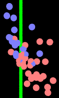
 From numbers tabulated by The Glittering Eye: the horizontal axis is the tax-consumption ratio, the vertical is the logarithm of income per capita. One extreme outlier is omitted, without guilt as it’s a special case.
In a perfect world the dots would represent counties, scaled for population, shaded according to the popular vote. But any of that would mean exerting effort.
That’s fascinating. Now if I only knew what to make of it . . .
And may I assume the outlier was D. C.?