I’ve long had an idea to design “outline” typefaces which, at appropriate low resolution, would mimic certain bitmap fonts that have sentimental resonance.
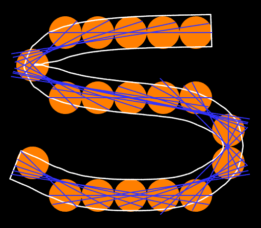
The orange discs are the original dots, of course. The blue arcs are least-squares fits (linear, quadratic) to subranges of the dots. The arcs are blended with a weighting function that favors longer arcs, as well as the middle of each arc. Finally, the stroke is thickened by adding ±i/2 to the parametric variable.
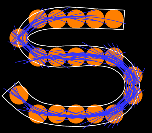
This is the first version in which the stroke-ends are neither brutally stiff nor (in some cases) grotesquely exuberant. I don’t know yet whether the lumpiness, here and there, reflects a flaw an opportunity to improve the blending function or a limitation of the cubic splines used to simplify the final curve.
(I previously made a TrueType version of Apple’s “Los Angeles” font, by a much more ad hoc approach.)
I hear that all the cool kids are using generalized clothoids: curves in which the curvature is a smooth function of arc-length. I know how to go about it but it involves some awkward integrals so I’ll need a fancy math package, unless I can make do with Taylor series.
So far, my Taylor series blow up at the ends of all but the simplest strokes (like ‘c’).
So you do it piecewise.